A living reference for the Nomad Solutions brand, kept current as the work evolves. The voice is the skilled guide, calm and precise. It runs on restraint and exact geometry. The waypoint mark appears rarely, the letterforms are drawn to spec, and nothing is decorative without a reason.
Logo & the arrow motif
Wordmark typefaces
The lockup pairs two faces. NOMAD is drawn from Sora. The custom N and A add the bearing, origin dot, and waypoint counter. SOLUTIONS is set in Outfit, all caps and tracked.
Geometric grotesk, weight 600. The wordmark redraws the N and A; everything else is Sora as-is.
Outfit Medium, all caps, wide tracking. Sits flush-left under the N as the steady counter-voice to the wordmark.
Keep SOLUTIONS quiet: tracked, gray, and locked to the N's left edge. It supports the wordmark; it never competes with it.
Never set it in Sora, in ink black, lowercase, or tightly tracked. Don't center it or let it grow past the wordmark width.
Construction
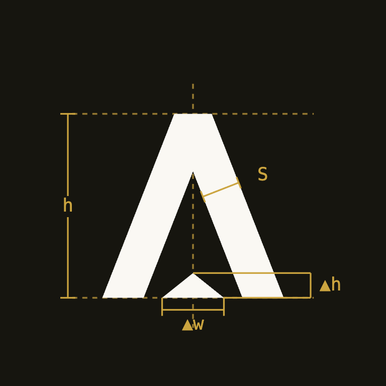
Every measure keys to one module, the stem width S. The mark is scalable, so the rules are ratios of S (plus scale-free angles), never fixed pixel values.
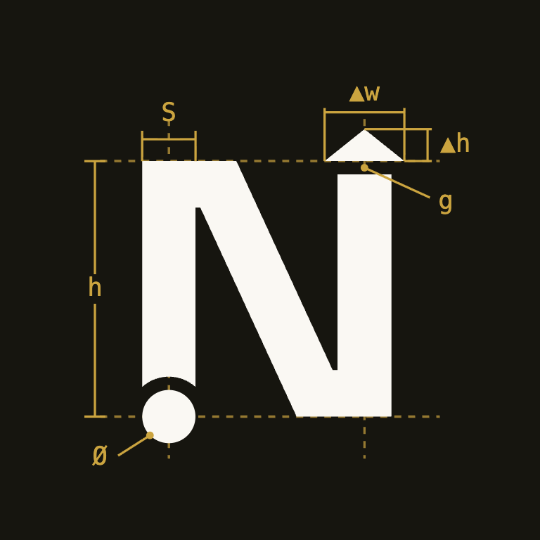
The dot and the bearing are one gesture, mirrored across the stroke.
- The origin dot is 1.0 S wide and centered on the baseline, so its edges meet the stem's.
- It detaches from the stem foot by the stroke gap g.
- The bearing echoes the move above the cap line: base on the cap line, right stem stopping g short, so the same gap sits under the arrow.
- Its base is 5/4 S and its height 1/2 S (the dot's radius), which sets the 5:2 waypoint.
It reads as a waypoint, not a slope to match against the legs.
- The inner arrow is locked to the 5:2 waypoint, the same triangle as every marker in the system.
- Letter and arrow share the apex centerline, not the slope; they are deliberately not parallel.
- The leg angle is left to Sora; the typeface sets it, so we don't dimension it.
- A quieter second arrow sits in the counter above, left in the negative space, unmarked.
The waypoint
The waypoint is the only decorative element in the system, the N's bearing lifted out as a standalone 5:2 triangle. It appears small, intentional, and rarely, a marker, not a pattern.
- Platform strategy
- Custom development
- Retainer support
A small square, never the waypoint. Bullets repeat by nature; the triangle has to stay rare.
Marks the start of a section. One per section, baseline-aligned with the label.
Buttons nudge the stroke arrow right on hover. Text links grow an underline from the left. Both ease over ~200ms; never instant, never a static underline at rest.
Reserve the waypoint for section eyebrows and the occasional brand moment, one per section, always pointing up. Lists use a small square; directional cues (links, CTAs) use a plain stroke arrow. Ink or accent only, 10–16px in UI.
Never use the triangle as a bullet or list marker, and never in rows, wallpaper patterns, or oversized watermarks. No gradients, outlines, or rotation. If it repeats, it's wrong.
Favicon
The favicon is the N alone (dot and bearing intact), knocked out of an ink tile. It survives to 16px; below that the bearing reads as a single notch, which is fine. Never use the full wordmark as a favicon.
Embed code lives in the SEO handoff doc, section 02.
Color
Foundation: ink
Warm neutral scale anchored on the logo's two inks: ink-950 and ink-500.
Accent
Ochre, drawn from the logo. It carries links, buttons, and the arrow when it needs emphasis, never backgrounds larger than a button.
Warm sand, drawn from the logo. Low-contrast and tonal; the single brand accent.
Semantic
Three status families for feedback only, success, error, and warning. Success and error are the green and red from the Do and Don't cards; warning is a brighter amber, kept distinct from the ochre accent.
Confirmations and valid states. The green from the Do column.
Failures and destructive actions. The red from the Don't column.
Caution and reversible risk. A brighter amber, kept distinct from the ochre accent.
Typography
Geometric, pointed apexes, the closest Google-Fonts kin to the wordmark's letterforms. Weights 600/700, tight tracking.
Warm, highly readable grotesk for paragraphs and UI. Weights 400/500/600.
Eyebrows, labels, code, small metadata. Always small, uppercase tracking 0.12em for labels.
Scale: mapped to Tailwind steps
Spacing & shape
Square corners everywhere; the brand is geometric. rounded-none on cards, buttons, inputs. No shadows; hierarchy comes from the 1px ink-200 border and background shifts (cream → card white).
max-w-6xl (1152px) page container, max-w-prose (65ch) for reading text. Section padding py-24 / py-32.
Tailwind tokens: handoff
Drop-in @theme block for your global CSS (Tailwind v4, CSS-first). The accent scale is whichever candidate you approve.
/* app.css: Tailwind v4 CSS-first tokens */
@import "tailwindcss";

@theme {
  /* neutrals: anchored on the logo's two inks */
  --color-ink-50: #f2f0ea;   --color-ink-100: #e5e2da;
  --color-ink-200: #ccc9c0;  --color-ink-300: #aeaaa0;
  --color-ink-400: #918d83;  --color-ink-500: #75726a;
  --color-ink-600: #5a564a;  --color-ink-700: #423f35;
  --color-ink-800: #2e2c24;  --color-ink-900: #211f18;
  --color-ink-950: #16150f;  /* logo ink */

  --color-cream-50: #fffefb;   /* cards */
  --color-cream-100: #faf8f3;  /* page background */
  --color-cream-200: #f4f1e9;  /* alternating bands */

  /* accent: ochre (approved) */
  --color-accent-50: #faf6ea;  --color-accent-100: #f4ecd2;
  --color-accent-200: #e9d9a4; --color-accent-300: #dcc06f;
  --color-accent-400: #cba43f; --color-accent-500: #b78c21;
  --color-accent-600: #a2781a; --color-accent-700: #826012;
  --color-accent-800: #694e14; --color-accent-900: #574117;

  /* semantic: success (pine) */
  --color-success-50: #f0f4f1;  --color-success-100: #e0e9e2;
  --color-success-200: #c3d4c8; --color-success-300: #9fb9a7;
  --color-success-400: #748f7e; --color-success-500: #4a6b56;
  --color-success-600: #3c5a47; --color-success-700: #314a3a;
  --color-success-800: #283c30; --color-success-900: #213127;

  /* semantic: error (clay) */
  --color-error-50: #faf1ed;  --color-error-100: #f4e0d8;
  --color-error-200: #e8c4b5; --color-error-300: #d9a18b;
  --color-error-400: #c97c5e; --color-error-500: #bd5f3f;
  --color-error-600: #a84e31; --color-error-700: #8c3f28;
  --color-error-800: #733523; --color-error-900: #5f2d1f;

  /* semantic: warning (amber) */
  --color-warning-50: #fdf4e8;  --color-warning-100: #fae1bd;
  --color-warning-200: #f3c585; --color-warning-300: #e9a448;
  --color-warning-400: #dd8a23; --color-warning-500: #c67212;
  --color-warning-600: #a25a10; --color-warning-700: #7e4712;
  --color-warning-800: #663b14; --color-warning-900: #543114;

  /* type scale: fluid, clamp(min .. max) */
  --text-6xl: clamp(2.5rem, 1.5rem + 4vw, 3.75rem);     /* display */
  --text-5xl: clamp(2rem, 1.35rem + 2.6vw, 3rem);       /* h1 */
  --text-3xl: clamp(1.5rem, 1.25rem + 1vw, 1.875rem);   /* h2 */
  --text-xl: clamp(1.125rem, 1.05rem + 0.3vw, 1.25rem); /* h3 */
  --text-lg: clamp(1rem, 0.95rem + 0.25vw, 1.125rem);   /* lede */
  --text-base: 1rem;     /* body, fixed */
  --text-sm: 0.875rem;   /* small, fixed */

  --font-display: "Sora", sans-serif;          /* headings, 600/700 */
  --font-sans: "Hanken Grotesk", sans-serif;   /* body, 400/500/600 */
  --font-mono: "JetBrains Mono", monospace;    /* labels, code */

  --radius-*: initial;  /* square corners throughout */
}

/* type ramp: 6xl display · 5xl h1 · 3xl h2 · xl h3 · lg lede · base body
   rhythm: py-24/32 sections · p-8 cards · gap-6 grids · max-w-6xl container */